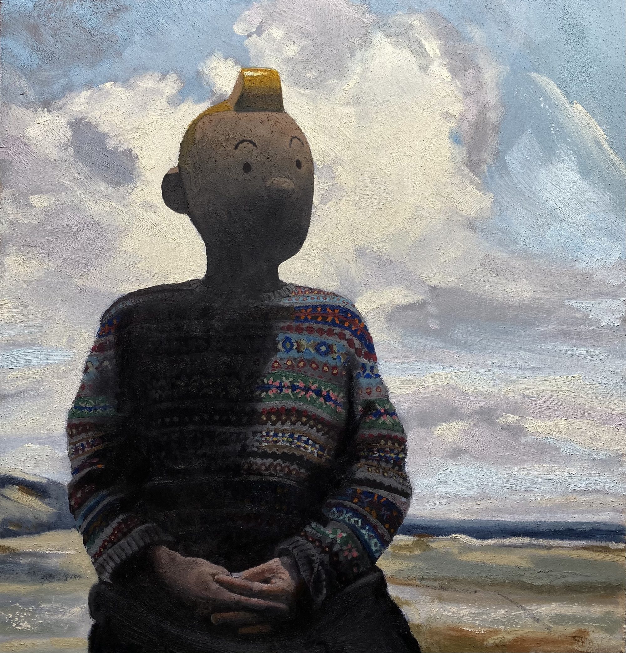
I’ve recently switched to Michael Harding oil paints to see what all the fuss is about, and my paintings completely changed in a moment. I know the science, but I couldn’t say for sure WHY these paints handle so differently. What I do know is that I haven’t mixed any combination of colours yet that haven’t been absolutely beautiful to my eye, and working wet in wet is a dream and a doddle. All in all my work just ends up being better than I might have hoped it would be and incredibly, a pleasure for me to look at the colours, shapes and textures rather than at what I might have done differently.  Blossom in Oil on Board 80 x 125mm
A Blossom a Day
A Blossom a Day. No.402. The Blossom Massive. This is our largest painting yet at a cracking 24ft x 14ft Blossom had to hold the ladder while I did the high bits. It’s a very special commission for the entrance at the National Portrait Gallery. Wait…. what’s that Blossom? Right. Well, Blossom got the measurements wrong apparently. It was supposed to be 24 x 14 CENTIMETRES and it’s for National EXPRESS. Stares into camera and sighs. 😡 https://www.instagram.com/davidwslack

A Few Prints
Hello hello. I had some lovely large prints made for me by the brilliant Martell in St Leonards, of some of my paintings and have each of the below available. They are £85 each including p&p within the UK. I will be offering more soon. They are beautifully printed and sit within a nice white border at 50cm x 40cm ready for (standard frame size) framing. These few prints are the first in a series and will be signed and numbered. If you arrived through lovely Suzi Ruffell’s instagram you’ll have seen the size framed up. Just a simple skinny frame looks great. Please use my contact page if you are interested and thanks for looking folks. XXX


A Blossom a Day
Well it’s Day 41 of the Blossom a Day project and I’m having a lovely time using Dr Martin’s liquid watercolours. They interact so interestingly with each other. Layering with bleed-proof white makes beautiful accidental dreamlike marks and colours. This is great. Can’t wait to get stuck in to the next one.

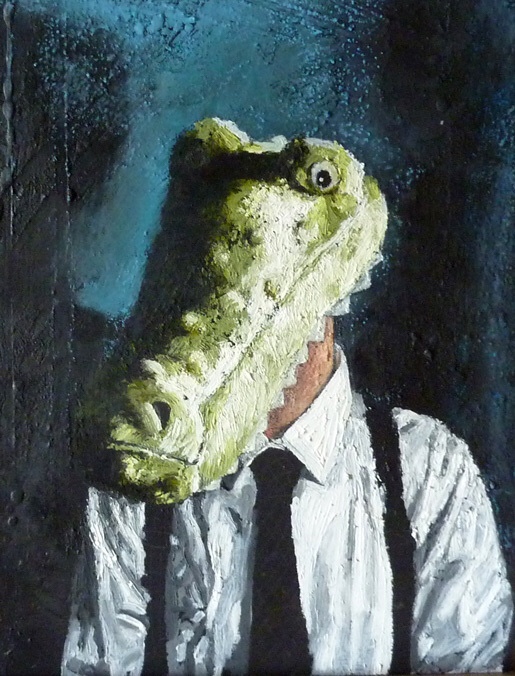
Snappy Dresser
I was asked to do a show with around twenty paintings, so I trained myself to sit and paint for between four to eight hour chunks at a time. Yikes! Doesn’t sound like much, but I don’t breath when I paint so I done good, and NEVER think about anything other than the painting in hand. Dull boy. With a deadline though, it seems I can do it. But I appreciated the discipline and loved the results.
So I sketched this as I walked the dear doggies as usual….

OMFG I’m good.
I had a strong image in my head of a child, cold and isolated against a pale blue nursery wall. He was wearing the head of a plush crocodile. The head looks bold and a bit dopy yet wry (how difficult can that be?). We are uncertain as to whether he has put it on himself, or has been made to wear it, but he is sitting stiffly upright with his arms straight down by his sides.
I put together a swift rough Photoshop effort to get an idea of composition.

But didn’t like it – found it too bold and obvious somehow. The space around the figure needed to be more important. It was to tell half of the story. There needed to be a large thinking space over his head. The Light has to come from the left for this one, and that hat had to go straight away. But I am happy with a generally darker and more shadowy feel than I’d originally envisioned.

So I get a board and texture it heavily with sand and gesso and drops of varnish thinking about the composition and get the textured shadows where I want them.

Oh this is great. I seem to start with the background just recently, I think to set the atmosphere. Also, oddly I find it sometimes to be the trickiest part to get right. If I feel moderately happy, I’ll continue, as it always seems to fall into place and work later on. So often I feel I am looking at just a load of paint, but I am very happy to look at the texture and tone of this one already. I am mesmerised by this heavenly pale blue.

I know there’s nothing like blowing your own trumpet and all, but I could look at this all day. I have added some red-blues to make the light in the background sing. Feel like I can’t go wrong now.

Probably should have inserted another stage earlier, but got carried away by the seriously rough texture and juxtaposition of these greens and blues. Whoohoo. I will say however that I lost faith for a moment at the beginning of the head painting. It was looking absolutely rubbish for a bit and I was convinced that I’d just have to give up painting once and for all and take to my bed with a bottle of vintage port, and a warm whippet.

But all is good in the garden. Look at this gorgeous surface. What a joy. What a sexy beast. The story dramatically changed and the star of the crocodile painting has become a man with shirt and braces. I wondered if the requisite neck hair might be an issue, but it has gone on a treat. Start with the very soft white (I am keeping the studio very warm for this one), and as ever, want to leave every thick stroke just as it is.

Enjoying blocking in the folds in the stiff cotton shirt. Any dapper gents out there should do themselves a favour and check out the fantastic http://www.vintageshirtcompany.com. If you can get to the shop in Lewes even better. You will literally walk out in a different era, never to be seen in Topman again.

Pretty much there with the shirt, and cor – I have loved doing that. Well rough. These Sennelier oil pastels have a positive quality about them which feels like a direct transference of what I am aiming and hoping for, they then add something organic and unexpected of their own, so as in Raku firing it is easy to love ones own painting, as really you are only responsible for a very small part of it.

But I digress. FINISHED. HAPPY HAPPY HAPPY. And though I say it myself – should you buy this painting (and I think you should), the tie alone is worth twice the price, so you’ll be bagging yourself a bargain. So ask yourself this – can you afford not to?
